How Behavioural Science Has Helped Improve the Communication of Tornado Forecasts
This is a guest post by Robert Qin, doctoral candidate at the University of Washington.
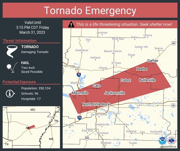
Geospatial visualization and color-coding are commonly used in various weather and climate forecasting scenarios. Most likely, the weather forecasting app or website you frequently use displays a map of your region with color-coded regions indicating specific weather event properties. Alternatively, you may have come across numerical forecasts (e.g., “a 30% chance of rain”) or any combination of these formats. The figures below provide examples of these different formats for tornado emergencies.

Currently used tornado warning system by the US National Weather Service. The region inside the polygon is considered at-risk for a tornado event. Source: NWS Tornado (@NWStornado) / X (twitter.com).

An example of the use of geospatial visualization in conjunction with color-coding from the US National Oceanographic and Atmospheric Administration. In this example, a red monochromatic scheme is used. A darker shade of red represents a higher number of tornado watches being issued at the location in 2023. Source: 2023_torww_to_date.png (1140×709) (noaa.gov).

An example of a tornado warning using geospatial visualization in conjunction with color-coding representing tornado likelihood from Qin et al., 2023. In this example, a red monochromatic scheme is used. A darker shade of red represents a higher likelihood of a tornado hitting the location.
The current tornado warnings issued by the US National Weather Service utilize geospatial visualization. However, a drawback is the lack of precision since the likelihood of tornadoes can vary within the warned area. On the other hand, color-coding enhances precision, but it can lead to confusion as people might mistake likelihood for severity. Could numerical forecasts help resolve this dilemma?
To address this question, researchers from the University of Washington and the National Center for Atmospheric Research conducted studies comparing different formats. In particular, participants were asked to imagine being on a road trip, checking into a one-story motel, and receiving a tornado warning on their cell phones. Their objective was to use the warning to decide whether to seek shelter or not (participants were randomly assigned to receive one type of format). They underwent 68 trials, with their motel location changing on a grid for each trial. The researchers assessed participants’ sheltering decisions, perceived likelihood, and trust in the forecast.
To incentivize participants to make optimal choices, a point-based cost-loss system was implemented. They began with an initial balance of virtual points and earned real money based on their end budget. Each decision had real consequences; for example, seeking shelter incurred a loss of 90 points to represent the inconvenience of moving, while staying put carried no immediate cost but resulted in a significant loss if a tornado actually struck (1,000 points). This cost-loss system also served as an economic benchmark for the participants’ decisions, based on expected value (details in the paper).
The combined results indicate that numerical forecasts resulted in better decisions, perceived likelihood estimates that were aligned with actual probabilities, and greater trust in forecasts, except for low probabilities. The fact that numbers improved decision-making is in line with other studies that have shown that that is the case. While other authors have indicated suboptimal decision-making with numerical forecasts, this study implies that this is not the case when it comes to tornado predictions. Numerical forecasts are more granular and as a result allow users to make more accurate decisions in the long-run.
But what about color-coding? Colors are known to aid comprehension when visualizing the carbon footprint intensity of certain products and services, for instance. However, in this context, colors had the opposite effect, as people interpreted the color-coded regions’ intended meaning (likelihood) as severity. These unintended interpretations can stem from various sources. For example, red is often naturally associated with threats and is used to signal danger in various contexts. In weather forecasting, different shades of the same color (such as red) are frequently used to represent the extent of a weather event (e.g., wind speed, precipitation amount), with darker shades indicating greater extents. This association used in weather forecasting might also have affected perception of the tornado warning, where colors represent a different property.
In summary, while geospatial visualization and color-coding offer clear advantages in swiftly and efficiently conveying readable and understandable information, they do come with considerations and potential pitfalls. Unintended interpretations associated with specific colors can lead to misinterpretation of warnings. Nevertheless, these considerations are not necessarily drawbacks, as they can be utilized to encourage individuals to take more appropriate actions. They can be especially valuable in high-impact, low-likelihood events like tornadoes, where people might neglect protective measures due to the low likelihood, despite the potential for significant consequences. However, whether or not geospatial visualization and color-coding should be used for such purposes is a different issue. The main point is that numerical forecasts help people make better decisions when it involves weather forecasts, specially tornado forecasts..


